You may have noticed that I haven't been tatting much. That's because I decided to take a breather and do something different. I went through my stored pictures and found one that I liked and re sized it to fit on an 8x8 inch square. Then I printed it on the laser printer and ironed the image on the cloth so that I can embroider it..
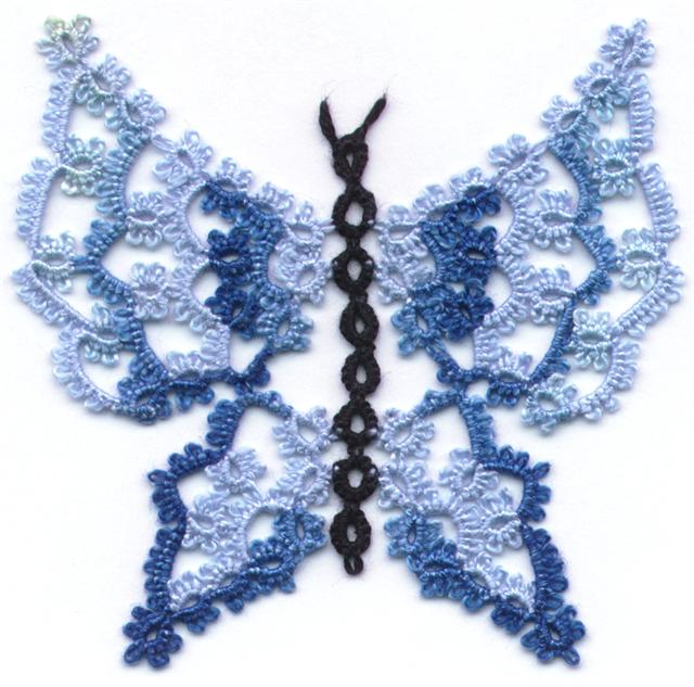
This project is also giving me fits. I know that I did the first image, a blue butterfly on an 8x8 square. Imagine my confusion when the finished square was closer to 7.5 inches square. I had to adjust the image by half an inch to make them roughly the same size before I started.
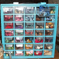
This cabinet holds my embroidery threads left over from the days when I did a lot of petit point. Petit point uses several shades of different colours to paint pictures in thread so I selected three shades in the colours I wanted and began to stitch. I like using long and short stitch to blend colours together for a realistic effect. Because the laser print image isn't as dark as a transfer image, I used an outline stitch in the darkest shade for the central image while I could still see it clearly and then started laying down colour in the medium shade and then switches to a paler shade for part of the picture.

It looked like crap so I cut and pulled all the threads and decided to do the whole thing in the medium shade. Theoretically, it should look good with the outlines in a dark shade and the rest in a lighter colour. About 2 days into painting the image it dawned on me that the reason to butterfly was smaller was that it had shrunk when I washed it. I didn't wash this one before I started and I know better, which means that when it shrinks that half inch, everything is going to pucker.
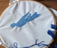
So here it is done in 2 shades. What? You can't see 2 shades? Drat! That means that this bird that has already taken about a week of stitching, may pucker enough that it's totally unusable and I have to re-do the outline parts. I've spent too much time on it not to finish it, but when I do finish it and wash it, it's liable to turn into garbage. I need to re-do the outline areas in a darker colour to make them stand out and I'm already disenchanted with it.

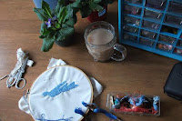
But here I am ready to re-do the outline. I'm working in the light from the window, because these 2 colours are so close to one another, that I can't tell the difference under regular lamp light.
 The darker colour laid across the bottom of the picture is the next shade darker and so far it's working well. Too bad this may be an exercise in futility.


No comments:
Post a Comment